The puzzle
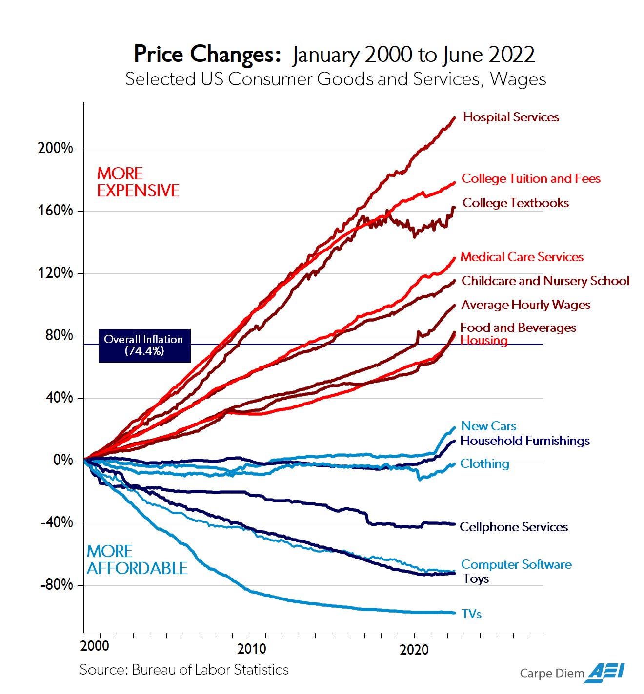
Mark Perry’s so-called “chart of the century” (2020) shows a striking divergence in US prices since 2000. Televisions, clothing, software, and toys have all fallen sharply in real terms. Hospital stays, college tuition, and childcare have risen significantly.
One popular explanation runs along supply-side lines and has been formalised as “cost disease socialism” (Hammond et al. 2021). On this view, the expensive sectors share a common feature: heavy government involvement. Subsidies – insurance mandates, Medicare and Medicaid, federally backed student loans – boost demand, while licensing restrictions, worker-to-child ratio regulations, and other supply-side constraints prevent quantity from expanding to meet it. When demand rises but supply cannot, prices rise instead. The diagnosis: government simultaneously inflates demand and suppresses supply. Remove the distortions, and prices would fall.
This account is not entirely wrong; regulatory constraints and subsidies do amplify costs. But it runs into a serious problem: the pattern of divergence precedes many of these policies and appears across countries with radically different healthcare and education systems. It does not explain why this same fan-shape emerges in Canada, Germany, and the UK, where the mechanisms of government involvement are entirely different.1 A structural explanation is needed, one that operates below the level of any particular policy regime (Helland and Tabarrok 2019).
Baumol’s cost disease is that explanation. It requires no market failure, regulatory capture, or administrative bloat to produce the divergence. It needs only three ingredients, each of which is uncontroversially present in any modern economy. Understanding this should radically change your views on why some sectors get more expensive, and therefore how and if you think it can be fixed.
Baumol’s cost disease
William Baumol and William Bowen identified the mechanism in the 1960s while studying something apparently unrelated: the economics of the performing arts (Baumol and Bowen 1966; Sharpe 2026).
A string quartet performing Beethoven requires the same four musicians and the same amount of time to perform as it did in 1800. There is no way to automate it without profoundly changing the nature of the performance. But despite zero room for productivity gains, musicians’ wages must rise over time. Why?
If wages in manufacturing increase because automation makes factory workers more productive, wages in all sectors must eventually follow; otherwise the musicians quit and go work elsewhere. The cost of a concert ticket therefore rises relentlessly, even though nothing about the performance has become less efficient.
Baumol called this cost disease. Three ingredients produce it:
- Uneven productivity growth. Some sectors achieve large annual gains through automation and scale. Others, such as those focussing on human services, are much less ammenable to productivity improvements.
- Competitive labour markets. Workers migrate toward higher-paying sectors, which are typically the higher-productivity sectors, so wages rise economy-wide.2
- Unit cost divergence. Higher wages with stagnant productivity means higher cost per unit of output. Higher wages with rising productivity holds cost down.3
The Perry chart is what this looks like after decades of compounding.
A minimal model
The formalization below follows Baumol (1967), adapted here to discrete time – Baumol’s original uses continuous-time exponentials \(e^{rt}\), while the discrete form \((1 + g)^t\) is algebraically equivalent for the small annual rates typical in practice. Extending from two sectors to \(N\) is a natural pedagogical step: the logic is identical, and any sector with \(g_i\) below the progressive benchmark experiences rising unit costs.
The core idea is simple: unit cost = wage ÷ productivity (notice this ignores material and energy costs). Here the units are: wage \(w\) in currency per worker-hour (for example, £/worker-hour), productivity \(A\) in output units per worker-hour (for example, consultations/worker-hour), and unit cost \(c\) in currency per output unit (for example, £/consultation).4 If a worker earns £30 per hour and produces 10 units per hour, each unit costs £3 in labour. If productivity doubles but the wage holds steady, the unit cost halves to £1.50. If the wage doubles but productivity holds steady, the unit cost doubles to £6. Three equations make this precise: 1) productivity , 2) wages, and 3) unit costs, over time.
Baumol’s original model (1967) has just two sectors: one stagnant (zero productivity growth) and one progressive (constant positive growth rate). Here that structure is extended to \(N\) sectors – classified as progressive or stagnant – so that the simulation can compare multiple real-world sectors simultaneously. Each sector has an annual productivity growth rate \(g_i\): the percentage by which output per worker grows each year.
Productivity at time \(t\) is:
\[A_i(t) = A_i(0) \cdot (1 + g_i)^t\]
\(A_i(0)\) is the starting output per worker in sector \(i\). The factor \((1 + g_i)^t\) is compound growth, the same arithmetic as interest on a savings account, applied year after year. A sector with \(g_i = 0.05\) doubles its output per worker roughly every 14 years; a sector with \(g_i = 0\) never improves at all.
NoteA note on sector productivity rates
The productivity rates used in the simulation below are illustrative, not formally estimated from data. Televisions and other consumer electronics are assigned high \(g\) values reflecting quality-adjusted price declines broadly consistent with Moore’s law, while toys are assigned more moderate but still clearly positive productivity growth. Healthcare is assigned \(g \approx 0.1\%\)/yr – one of the most contested parameters in the Baumol literature. Imaging technology, minimally invasive surgery, genomics, and pharmaceutical innovation have driven large improvements in clinical outcomes, but outcome quality is notoriously hard to measure, so official productivity statistics look flat even when patients benefit more per visit.
The economy-wide wage \(w(t)\) is anchored to productivity growth in the progressive sectors. In Baumol’s original two-sector model, the progressive sector’s wages rise with its productivity, and the stagnant sector must match that wage or lose its workforce to better-paying employers. The common wage is therefore:
\[w(t) = w(0) \cdot (1 + g_p)^t\]
where \(g_p\) is the growth rate of the single progressive sector. In the \(N\)-sector simulation here there is no single progressive sector, so \(g_p\) is replaced by \(\bar{g}_p\), a weighted average productivity growth rate across a small set of sectors used to approximate Baumol’s progressive frontier:
\[w(t) = w(0) \cdot (1 + \bar{g}_p)^t \qquad \text{where} \quad \bar{g}_p = \sum_{i \in \mathcal{P}} \omega_i g_i \qquad \text{with} \quad \sum_{i \in \mathcal{P}} \omega_i = 1\]
Here the explorer uses illustrative employment-style weights so that tiny frontier sectors do not mechanically over-determine the economy-wide wage path.
The outside-option mechanism is the same: workers in stagnant sectors can, in principle, migrate to progressive ones, so stagnant-sector employers must pay whatever workers could earn there.
NoteOn terminology: progressive vs stagnant
Baumol’s original model uses the labels progressive and stagnant. In this multi-sector version, it is clearer to separate three ideas that can otherwise get conflated.
- Productivity growth: each sector has its own \(g_i\).
- Wage benchmark: \(\bar{g}_p\) is a stand-in for Baumol’s progressive sector, proxied here by a weighted average growth rate over a small set of frontier sectors rather than inferred mechanically from every plotted sector.
- Cost direction: whether a sector’s unit cost rises or falls is an outcome, determined by comparing \(g_i\) to the wage benchmark.
In the baseline equations the benchmark is \(\bar{g}_p\), and cost direction follows a threshold rule:
- If \(g_i > \bar{g}_p\), costs fall.
- If \(g_i = \bar{g}_p\), costs are flat.
- If \(g_i < \bar{g}_p\), costs rise.
So a sector can have positive productivity growth and still see rising relative costs if its growth rate is below the wage-growth benchmark. In the chart below, colours simply distinguish sectors; they do not encode economic categories.
NoteAssumptions behind the common wage
Treating \(w(t)\) as a single economy-wide number is a deliberate simplification. It rests on three assumptions that hold approximately but not perfectly in the real world:
- Perfect labour mobility. Workers can move freely between sectors without retraining costs, geographical barriers, or skill mismatches. In practice, a nurse cannot become a software engineer overnight. Wage equalisation happens gradually, over years or decades, not instantaneously.
- No labour market segmentation. The model treats all workers as interchangeable. In reality, care workers, teachers, and musicians occupy distinct labour markets with limited overlap with high-productivity sectors. This partly explains why care workers have historically been paid below economy-wide average wages; the equalisation mechanism is weaker for them.
- Wages equal marginal productivity. Competitive pressure is assumed to keep wages anchored to worker output. Unions, monopsony employers, and licensing boards all disturb this.
- Progressive-sector anchoring. Wages are anchored to a weighted average growth rate of a small set of sectors chosen to play Baumol’s progressive-sector role. Using weights is a pragmatic way to stop very small frontier sectors from over-setting the wage benchmark. However, the choice of which sectors are used in that benchmark, their assigned \(g\) values, and their weights still shifts every cost curve. Treat absolute cost levels as illustrative rather than precise.
To stay close to Baumol’s baseline model, the scenario explorer keeps a common wage benchmark rather than adding a separate labour-market segmentation parameter.
Unit cost in sector \(i\) (wage per worker divided by output per worker) is:
\[c_i(t) = \frac{w(t)}{A_i(t)} = \frac{(1+\bar{g}_p)^t}{(1+g_i)^t}\]
Normalising so that \(c_i(0) = 1\) (which sets \(w(0) = A_i(0) = 1\) without loss of generality), this ratio measures how expensive sector \(i\) has become relative to its own starting point. The logic is transparent:
- If \(g_i > \bar{g}_p\): the denominator grows faster than the numerator, so costs fall relative to baseline.
- If \(g_i < \bar{g}_p\): the numerator grows faster, so costs rise.
- If \(g_i = \bar{g}_p\): unit cost stays flat.
The speed of divergence is governed entirely by the gap \(\bar{g}_p - g_i\). Nothing else: no subsidies, no regulatory capture, no administrative bloat. Just the arithmetic of differential productivity growth running forward in time.
The diagram below shows the causal chain. Two things happen simultaneously: fast sectors get more productive, pulling up economy-wide wages; slow sectors cannot match that productivity gain, so their unit costs rise.
The simulation
Below is the Perry chart, generated from scratch using only the model above. Each sector is assigned a plausible illustrative productivity growth rate broadly consistent with empirical orders of magnitude. The chart models only the structural Baumol component – no subsidies, insurance distortions, or regulatory effects are included. The divergence emerges entirely from \(c_i(t)\), displayed as percent change since 2000 so the visual framing is closer to the original Perry chart.
All sector productivity rates are fixed at their baseline values except computer software, which can be raised to simulate a period of exceptional technological progress (such as the AI productivity gains now being claimed). Raising software productivity raises the progressive-sector average wage rate \(\bar{g}_p\), tightening the cost squeeze on slower sectors. In this baseline, \(\bar{g}_p\) is proxied by a small basket of faster goods sectors: televisions, clothing, computer software, toys, and food & beverages. The benchmark uses illustrative employment-style weights, so sectors such as food and clothing count more for wage setting than frontier sectors such as televisions. Cost direction is then straightforward: costs rise when sector productivity growth is below \(\bar{g}_p\), and fall when it is above. The line colours simply help distinguish sectors visually. Adjust the software control and the chart updates immediately.
A few things to try:
- Raise computer software \(g\) from 9% toward 10–12%, simulating a period of AI-driven productivity gains. Notice that this widens the divergence: a faster progressive sector pulls \(\bar{g}_p\) up, raising the wage floor that all stagnant sectors must meet. More technology in the fast sectors makes healthcare and education relatively more expensive, not less.
- Watch clothing and food separately. Clothing sits close to the progressive benchmark and therefore stays near flat; food has a much lower \(g\) and drifts upward more clearly.
Limitations and open questions
This post presents Baumol’s baseline model largely as-is. That keeps the core logic transparent, but also bakes in assumptions worth interrogating.
Labour is the only input. Unit cost is defined as wage divided by output per worker. Energy, raw materials, capital depreciation, and land are absent. For sectors with high material intensity (pharmaceuticals, hospital equipment, construction) input-cost inflation driven by commodity prices or supply-chain disruptions can dominate the labour-cost channel entirely. The 2020s spike in hospital costs had a significant energy and supply-chain component that the Baumol model simply cannot see. A fuller treatment would express unit cost as a weighted sum over all factor inputs, each with its own productivity trajectory and its own price. That extension would be worth working through; it is not obvious that the divergence result survives unchanged when energy costs are themselves subject to large exogenous shocks.
The wage is a single number. The model pools all workers into one labour market with one wage. In practice, care workers, surgeons, and software engineers occupy largely segmented markets; the equalisation mechanism operates slowly and incompletely. This post keeps Baumol’s common-wage assumption rather than modelling segmentation dynamics explicitly.
Productivity growth rates are fixed and exogenous. \(g_i\) is treated as a constant, but in reality it responds to investment, policy, and technological opportunity. Some sectors speed up, plateau, or slow down as technologies mature and bottlenecks shift. A fuller model would allow \(g_i\) to vary over time rather than treating each sector’s productivity path as a fixed compound-growth process.
Productivity gains are unlikely to compound forever. The baseline equations use constant growth rates, which mechanically produce exponential trajectories. That is useful for isolating Baumol’s mechanism, but probably unrealistic in the very long run. If progressive sectors approach near-full automation, labour input per unit can move toward zero, so labour cost no longer falls through wage-productivity dynamics. Unit cost is then bounded below by non-labour inputs: energy, raw materials, and capital maintenance. A natural next modelling step is a multi-input version in which labour shares decline over time and costs converge toward an energy-material floor rather than diverging exponentially forever.
Sectors are treated as independent production units. The model has no input-output linkages: healthcare does not buy software, education does not consume energy. In a real economy, productivity gains in progressive sectors reduce the cost of inputs to stagnant ones, partially offsetting the wage-floor effect. How large this offset is empirically is an open question.
The demand side is absent. Nothing in the model determines how much of each sector society actually buys. Cost disease raises relative prices, but whether quantity demanded falls, stays flat, or rises depends on income and price elasticities that the model ignores. As aggregate income rises alongside productivity, the income effect can sustain or even increase demand for expensive stagnant services. Baumol acknowledged this but the basic model does not formalise it.
Key takeaways
The Perry chart shape is predictable from first principles. Differential productivity growth, combined with competitive labour markets, mechanically produces the fan-shaped divergence we observe. This is the necessary baseline any other explanation must beat.
Rising costs are not the same as inefficiency. In stagnant sectors, Baumol’s mechanism represents no decline in productive efficiency. Demanding that a hospital ward achieve the same cost reductions as a semiconductor fab is a category error: one sector can substitute capital for labour at scale, while the other often delivers value through skilled human time itself. Policy responses that treat structural cost growth as waste will therefore be persistently frustrated.
Faster progressive sectors can widen divergence. When productivity accelerates in already progressive sectors, \(\bar{g}_p\) rises and pushes up the wage floor for stagnant sectors. The model therefore predicts that some kinds of technological progress can increase relative cost pressure in care-intensive services.
The political economy layer sits on top. Subsidies, licensing restrictions, and market power can amplify costs beyond the Baumol floor (Helland and Tabarrok 2019). But they cannot explain the shape of the divergence. Baumol is the skeleton; political economy is the flesh.
Affordability is a distributional question, not a structural one. The economy can afford stagnant-sector services even as they consume a rising GDP share, if productivity gains from progressive sectors are distributed broadly enough.
References
Baumol, William J. 1967. “Macroeconomics of Unbalanced Growth: The Anatomy of Urban Crisis.” The American Economic Review 57 (3): 415–26.
Baumol, William J. 2012. The Cost Disease: Why Computers Get Cheaper and Health Care Doesn’t. Yale University Press.
Baumol, William J., and William G. Bowen. 1966. Performing Arts: The Economic Dilemma. Twentieth Century Fund.
Hammond, Samuel, Daniel Takash, and Steven M. Teles. 2021. Cost Disease Socialism: How Subsidizing Costs While Restricting Supply Drives America’s Fiscal Imbalance. Niskanen Center. https://www.niskanencenter.org/cost-disease-socialism-how-subsidizing-costs-while-restricting-supply-drives-americas-fiscal-imbalance/.
Hartwig, Jochen. 2008. “What Drives Health Care Expenditure? Baumol’s Model of ‘Unbalanced Growth’ Revisited.” Journal of Health Economics 27 (3): 603–23. https://doi.org/10.1016/j.jhealeco.2007.05.006.
Helland, Eric, and Alexander Tabarrok. 2019. Why Are the Prices so Damn High? Mercatus Center at George Mason University. https://www.mercatus.org/publications/healthcare/why-are-prices-so-damn-high.
Perry, Mark J. 2020. Chart of the Century. https://www.aei.org/carpe-diem/chart-of-the-century-updated/.
Sharpe, Oli. 2026. Baumol’s Cost Disease. Video, Go Meta with Oli Sharpe, YouTube. https://www.youtube.com/watch?v=AwWKvtjQME4.
Footnotes
The temporal-precedence claim is partly logical: Baumol and Bowen identified the mechanism in 1966, and the structural divergence in healthcare and education costs is visible in OECD data from the 1960s and 1970s, before the modern US regulatory architecture (notably the ACA, 2010) was in place. The cross-country claim rests on firmer empirical ground. Baumol (2012) presents OECD comparisons showing the same cost pattern in countries with single-payer systems, social insurance systems, and mixed systems. Hartwig (2008) tests Baumol’s model econometrically across 19 OECD countries from 1970 to 2002 and finds support for the mechanism as a driver of healthcare expenditure growth independent of country-specific policy regimes. The claim is not that policy is irrelevant – it clearly amplifies or dampens costs at the margin – but that policy alone cannot explain a pattern this consistent across such different institutional settings.↩︎
When a factory installs better machinery, each worker produces more output per shift. Two forces push wages up: firms share productivity surplus to retain workers, and the economy-wide going wage rises as technology spreads across an industry. Economists call the connection between productivity and pay the marginal product of labour. Competitive pressure keeps wages anchored near this value – firms cannot persistently pay much less (workers leave) or much more (product-market rivals with lower unit costs undercut them). Over the medium run, productivity growth and wage growth track each other closely.↩︎
If a sector cannot become more productive, why must it raise wages at all? The answer is outside options. A nurse, a teacher, or a concert cellist can, in principle, retrain and take a job in a factory, a logistics firm, or a technology company. These transitions are not frictionless, but they are real. If wages in stagnant sectors stagnated while wages elsewhere rose, a growing share of workers would gradually leave. Employers in stagnant sectors therefore face a floor: pay close to what workers could earn elsewhere, or lose them. Society still needs these services regardless of cost – demand for healthcare and education is relatively inelastic – so providers pass rising labour costs onto consumers, insurers, or government budgets.↩︎
Dimensional check: \[ \frac{\text{currency}/\text{worker-hour}}{\text{output}/\text{worker-hour}} = \frac{\text{currency}}{\text{output}} \] so the expression is dimensionally correct.↩︎